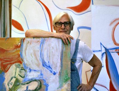
The Best of de Kooning’s Late Period

The “Willem de Kooning: Ten Paintings, 1983-1985” exhibition at the Gagosian gallery on Madison Avenue is grand in scale and vision. An expertly chosen sampling of the best works of the artist’s late period, the paintings sing together in a room that, while full of white space, seems barely able to contain them.
As John Elderfield notes in his essay for the show’s accompanying catalogue, it has been almost two decades since de Kooning’s late work has been explored in depth. The artist died in 1997. A group of paintings were in his Museum of Modern Art retrospective in 2011, but rather lost in the volume of other and earlier works. Despite Mr. Elderfield’s endorsement of them at the time, those paintings never really benefited by the comparison to the rest of the oeuvre.
Add in talk about dementia and questionable authorship and there is a reason viewers tend to rush through those late galleries, their attention and interest spent on decades prior.
Yet refocused in the hands of a gifted curator, such as Mr. Elderfield, who joined the gallery after his retirement from MoMA, where he organized the retrospective, what seemed spent and tawdry looks fresh and magnificent — a departure of the mind, perhaps, but not of the senses.
The 10 works on view were put on sale by the artist’s foundation to raise money for an endowment. Mr. Elderfield narrowed the years of focus to give cohesion to the show and to assert that these two years comprise, as he writes, “the classic period” of that style. He then looked at each of the 10 paintings in depth, all untitled save for one, called “The Privileged,” and assigned themes to each, to help classify them in the greater scheme of the period as well as unite them to overarching motifs throughout the artist’s career.
It can be overwhelming to see all of the paintings together. One, a late untitled work assigned the theme of “slippage,” is hung away from the rest. The separate vantage point helps makes sense of its individual merits and the subtleties of the painter’s brushstroke up close.
In the essay, this work’s inclusion and theme lead to a discussion of the artist’s working methods during this decade. Rather than a free-flowing gesture, de Kooning relied on tracings or projections of elements of other paintings in these late works and drew outlines on the canvas that were then filled in with color and surrounded by white paint. The slippage Mr. Elderfield discusses involves a glitch in the process where the original image slips, at first accidentally and then deliberately, to create new compositions, a process confirmed by one of de Kooning’s studio assistants.
There is a lot to be learned from the catalog, but like Matisse’s cutouts or Piet Mondrian’s Neoplasticist style, one may get the most from the paintings just by taking them in. The gallery is a room to be lingered in, to revisit, to focus on one and then another exclusive image at different times. The first visit must be devoted to the room as a whole. The dialogue between the paintings is so strong that it can be like following a dance. Despite this reductive style, the lines still seem molded by references to the figure in the most elemental way.
In addition to its name, “The Privileged,” from 1985, is singular in this show. It does not quite belong, but it is a work of power and beauty. One can see hints of Henri Matisse’s own late work in cutouts in it and some hints of Arshile Gorky, which Mr. Elderfield attributes more precisely back to Pablo Picasso.
The curator discusses the cutouts in his entry for this painting, with the theme of “metamorphosis.” The palette of yellow, red, and shades of purplish blue differs from the more red, white, and blue emphasis in the other paintings. The more static accumulations of shapes also differs from the fluidity of the earlier works.
In an essay devoted to the theme of ambiguity, Mr. Elderfield writes that the artist was likely attempting to have these paintings “stop making sense.” They can look like waves, ripples, or body contours, but they are most arresting just by contributing to the ebb and flow of the other paintings. Their asymmetry helps lead one through the gallery, implying a definitive climax before circling back onto themselves. It is a lovely ride.
The exhibition remains on view through Dec. 21.
