Dash and Holtzman at Drawing Room

It is funny, but I had to be reminded this week that Robert Dash wasn’t an abstract artist, not in the nonobjective sense anyway. The inveterate gardener, writer, and artist left us last month after a long illness, but his legacy in Madoo, his residence and conservancy, and his artwork, as well as a quite lengthy catalogue of columns he wrote for The Star over many years, will continue.
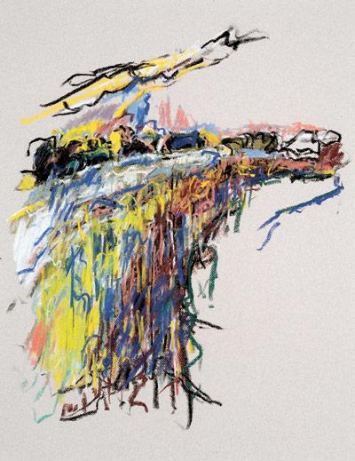
At the Drawing Room gallery in East Hampton, Dash’s most recent pastels are on view and they are quite abstract. One can still sense the landscape they were taken from, but the artist once said all of his landscapes were extrapolations from memory, their compositions taken from the sense of a place with a dollop of artistic fancy.
From earlier years, that recipe would have translated into more of a straightforward presentation of recognizable sites rendered in generalized daubs and planes of color and light. The work I had seen and begun to associate with him were his latest works, spied either at Spanierman Galleries in New York or on his studio walls in recent winters when attending lectures there. These were far more generalized and intuitive.
The “Blue Hill” pastels at Drawing Room are even further removed from reality, taking what appears to be a single or at least limited vantage point. The source, according to the gallery, is the “rocky shoreline of Blue Hill Bay” in Maine, where Dash committed the cliffs and vistas across the bay to memory. The resulting images are referential, but also a clear departure.
They are rather dynamic images, made more poignant and ecstatic by their execution at the dusk of an artist’s life. There is a sense of a hand and eye needing to fill the page with an expansive vision. Like Mont Sainte-Victoire for Paul Cezanne, also chosen as subject matter later in the artist’s life, Blue Hill becomes not just a landscape but a muse and icon, yielding infinite variety within a diminished visual range.
Coloration can be straightforward, as in “From Blue Hill II” from this year, which appears to be inspired by a sunny day with the blue sky reflected in the water, and its possible pendant, “From Blue Hill III,” drawn in more somber tones and grays from an overcast one. Contrast both with Number I, where yellows, reds, blues, blacks, and greens comprise the setting, or Number IV, where the rendering in reds and yellows is most expressionistic. Number IV is also very granular and crunchy; the red brings out the bite in the rocks.
He chose antique rag paper in beige and gray as supports for the pastels. Those executed on the gray paper tend to be the livelier of the works, bringing more contrast into play. Yet my favorite has to be Number VI. The piece is positively on fire, though not in the literal way of the previously described work. Here, the rendering is most naturalistic in hue, but there is a purity that makes it electrically charged. The atmosphere crackles. Perhaps it is because of this work that the other beige-based ones seem so, in fact, beige. But my verdict is no, they are more wan and hazy just because they are.
What is lovely about the show is how much it offers from so apparently little. The installation shows a real feeling for what pieces should hang together regardless of their chronology. Taking a spin multiple times around the single room with an additional work in the window yields fresh perspectives and correlations. It’s a show worth visiting more than once to view the art as well as to ponder the contribution of Dash to the greater artistic world.
Chuck Holtzman has the same measure-taking feel as an exhibition. Here, the Boston-based artist is contrasted with himself, taking sculptures he did in the early 1980s and recent works on paper as a snapshot and larger examination of his career.
The particular works chosen often seem to be directly related, as if the drawings were a kind of two-dimensional unraveling of the planar sculptural pieces. I like this. It’s elemental and obvious on one level, but it stops the viewer and opens the eyes to the process of perception in a lively way. On closer inspection there is not much cohesion to do a side-by-side comparison, but the suggestion of it is enticing nonetheless.
The black-and-white ink and watercolors are rich in tonality and lively in their geometric precision. Their angular purity on the one hand makes their more expressive cousins seem precarious and exciting in comparison, each complementing the other in an enriching, but not essential symbiosis.
Both shows are on view through Nov. 4.
