More Is More at Marder

I took a look at Ryan McGinness’s work at the Silas Marder Gallery, then I looked again, and then once more. No matter how familiar his world of idiosyncratic signs and symbols, there is always something new to see in their more-is-more layering.
His paintings, Sign Posts, and Sign Trees are on view both inside and outside the gallery, looking hierarchical in the barn and loft and downright trippy in the grounds. The Sign Trees just outside are attention-grabbers. Their custom-designed industrial aluminum trunks and branches hold a kaleidoscopic array of brightly colored aluminum panels of various shapes and sizes.
Each panel has been embellished with digitally printed high-reflective vinyl, cut in the personal hieroglyphs he has developed to layer into his works. The trees are new this year, and while not specifically designed for the Marder show, were chosen and completed for the site.
Mr. McGinness has developed a vocabulary of icons over the years by drawing them first and then digitally scanning the image to make a flatter, simpler design. Here there might be multiple icons on the same sign, but much of their complexity can lie in each icon’s individual structure.
Their logo-like generalization can seem tame and friendly at first, suggesting corporate blandness and a desire not to offend. That mirage evaporates quickly once the eye perceives a skate punk beating a homeless man, middle fingers sprouting a rainbow, skulls being invaded by foreign objects, and intestines dropping what intestines do. The harsher images are tamed with ducks, deer heads, and kitties, but each of these is tweaked and twisted to seem more menacing. Other recurrent motifs include eyeballs, snakes, high-heeled shoes, and hands. But this is just scratching the surface, and the Sign Trees are the simplest and most direct pieces in the show.
Inside, another Sign Tree looks more industrial and road-ready, with panels ofimple black vinyl on white with red accents. He had the individual panels fabricated at the same place that New York City has its road signs made, with the same reflective vinyl and painted aluminum. The panels are carryovers from a 2014 installation Mr. McGinness did with the city’s Department of Transportation. Fans, and others with perhaps less savory motives, removed the signs almost as soon as they were installed.
In one interview, the artist called his flat shapes, iconography, and geometric forms “a very personal aesthetic” that he has been developing for decades. It can be surreal and scary. The way the symbols communicate meaning is both subtle and immediate. Once you realize what you are perceiving, the visual information makes a straight shot for your brain, much more directly than the steps needed to perceive language.
Although Mr. McGinniss trained as a graphic designer and worked in commercial design, devising corporate logos, he always painted on the side. In 1996, he merged the two disciplines and developed his mature style. Just as his icons might be built up within an individual sign or piece, he also uses his motifs in full gallery or room installations with painted murals and decals on the wall.
The individual “Sign Post-Paintings” hanging on the lower gallery walls demonstrate the kind of melding of genres and mediums that his merging of art and design entails. Although he uses silkscreen for painting, which can be a straightforward graphic enterprise, his layering of symbols over and over again begins to look like Expressionism and then suddenly is. Using such a technique manages to place him in the improbable realm of both Jackson Pollock and Andy Warhol simultaneously, as Jeffrey Deitch noted of his work.
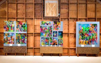
Most of the Sign Posts are pared-down versions of the more complex acrylic paintings on linen, inspired by his studio, that hang in the gallery’s loft. Certain symbols might stand out or play a part in what could be perceived as a composition, but many are subsumed in a deluge of gathered imagery. Some use a floorboard motif, which grounds each of his upstairs paintings and provides consistency when the upstairs and downstairs installations are viewed together.
Only three paintings grace the loft, but they are large and powerful. All three suggest that they are set in the artist’s studio, a centuries-old tradition that he adapts for his own reuse. His familiar flattened surfaces work similarly here, as the floorboards pile straight up the canvas until they look like a sedimentary layer. Then come the white buckets he uses to prop his paintings off the floor. Finally, there are renderings of finished paintings, placed atop a steel-gray ground.
There may be one or several of these panels included in the overall composition. The titles seem to clarify that the parts are not separate from the whole. “Making Someone Else’s Bed,” “Studies Show,” and “How Come Existence?” are both glib and ponderous. It is tempting to say they are meaningless, but certain accretions of symbols begin to make sense in their context and are hard to ignore.
Like everything else in the show, the paintings are really a personal experience. Some of the symbols’ messages are blatant, but others, like a Rorschach test, need a viewer’s own experience and psychological makeup to arrive at their meaning. Reading them is like trying to make sense of the endless bits and bytes of information we now assimilate every hour of every day. In that way, Mr. McGinness truly captures contemporary experience. The exhibition remains on view through Aug. 29.
