Opinion: Ray Parker On West 57th Street
Ray Parker, who lived and worked in East Hampton, and died in 1990, painted a group of oils in the years 1958 to 1965 which he called his "simple" paintings, to differentiate them from earlier work. He had received recognition as early as 1950, when he was included in the "New Talent" exhibit at the Museum of Modern Art.
In '58, he attempted to let color define the impact of his compositions. The resulting works depend upon subtleties of color variations too fine to be caught in the snares of language.
If, in another life, one had unlimited time, it would be pleasurable to devise names for all his earth-to-pastel tones - shade-on-the-back-of-a-red-house-at-4:30-p.m.-in-August, light-bursting-through-an-orange-leaf, etc.
It would be pleasurable, but pointless, because the naked eye instantly responds to Parker's vocabulary.
Washburn Gallery
I strongly recommend visiting the show of his paintings now on view at the Washburn Gallery, 20 West 57th Street in Manhattan.
Entering the skylit space, one is suddenly at ease. The paintings - although created in the era of Clement Greenberg's hegemony and adhering to formal principles of which he would have approved - are possessed of an unerring lightness, a sensibility which invites the viewer to contemplate their resonant stillness.
Most of the 20 works exhibited, which were recently discovered by the artist's two daughters and are on view for the first time, are small, but they have an impressively large scale.
The artist's deceptively simple strategy of laying down contiguous, non-overlapping areas of pure color never, surprisingly, degenerates into sameness. A mental vitality keeps every shape alive. One can tell these paintings were never rote for Parker, never dry intellectual exercises.
The care with which he defines the exact dimensions and contours of his forms is balanced by a captivating liberty with the paint. The edges of his shapes are always in motion and so are the interiors, where one can make out marks in the thickly applied medium, which looks as though it was spread on with a knife rather than by brush.
No form ever touches the edge of the frame, so that every shape appears to hover, or flutter, in space.
Varied Combinations
Often he paints lozenge-like forms, free-floating torsos of color that are sometimes combined with circular shapes, or squares with the edges rounded off.
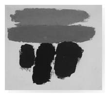
He relentlessly varies the combinations. In one painting, four horizontals lie on top of one another. In another, five verticals of different colors include a bright yellow and green side by side, one of the more shocking tonal juxtapositions.
The most stimulating works are those in which the artist pushes the limits of the formal strictures he has set up, combining horizontals and verticals, oblong and squat figures in the same painting. In these pieces, one has a vivid impression of seeing something.
Forceful Shapes
The easiest transposition, as in Rothko's paintings, is as landscape, but it is not necessary. In one work, two horizontals of different blues could be sky and sea, below which two greens and a black could be part of a shoreline.
This interpretation, though, is only a possibility. Parker makes sure to steer clear of literal readings, partially by the reminder of raw canvas surrounding the painted areas and partly by the forceful identities of his shapes, which assert themselves as that one undefinable thing they are.
Even where he relies on simpler combinations - three horizontal oblongs, for instance - a sensual, non-diagrammatic vibrancy presides.
Precise Framing
One small painting is composed of four rounded squares pushed up against each other, swelling dangerously close to the edges. The colors are dark purple, orange, and two varieties of olive-drab. The image pulsates like a flower in bloom or a building in late-afternoon sun and shadow.
In all the small paintings, the painted canvas has been cut into a rectangle and attached to a stretched canvas, implying that the artist painted these subjects on greater expanses of canvas and afterward decided where the borders should be.
This unusual approach to framing underlines the precision of proportions in these works.
Quiet Passion
The centerpiece of the show is a large 1958 painting in which two oblong verticals - one orange, the other olive-green - flank a lavender ovoid. The orange form is somewhat larger than the green one and points a little to the left.
Marks of charcoal can be seen near the forms, indicating Parker sketched the shapes in charcoal but pinned them down in paint, not necessarily following his loosely defined drawings.
The impression is one of calm, not improvisation, as though someone wandering in the woods had come to a fork and after pondering had decided on a direction. After having made the decision, he had no second thoughts.
This painting holds its own and continues to grow in interest over time.
These are quiet paintings. They are also passionate paintings, whose colors, sometimes somber, sometimes gaudy, provoke sensations of nature and emotions at once turbulent and refined.