Springsteen's Born to Run: Marking 40 by Battling Hunger

Remember 1975? Those alive that year would have witnessed the fall of Saigon, two assassination attempts on President Gerald R. Ford, the conviction and sentencing of three key Nixon administration officials due to Watergate, and the premiere of “Saturday Night Live.”
Musically, it was the year of singles such as 10cc’s “I’m Not in Love,” John Lennon’s “#9 Dream,” Barry Manilow’s “Mandy,” David Bowie’s “Fame,” and John Denver’s “Thank God I’m a Country Boy.”
It was into this milieu that Bruce Springsteen’s third studio album, “Born to Run,” was dropped on Aug. 25. The sensation it created was such that both Time and Newsweek featured him on the cover the same week, Oct. 27. In typical Springsteen fashion, he told Time, which called him “Rock’s New Sensation,” “I don’t understand what all of the commotion is about.”
Forty years later, there are still those who will forever think of him in terms of that album cover: full beard, long curly hair, motorcycle jacket, a guitar slung just so with an Elvis Presley button on the strap, leaning on the shoulder of a man who is revealed as Clarence Clemons, the E Street Band’s saxophone player, just on the other side of the gatefold.
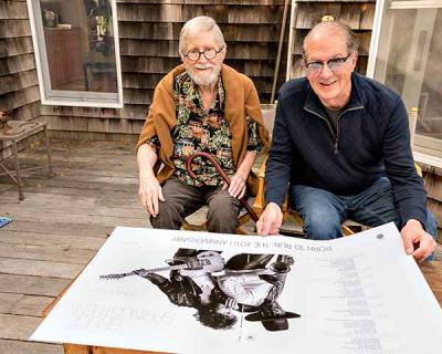
In honor of the 40th anniversary of the album, Eric Meola, the photographer, has led an effort to publish a commemorative poster, printed in an edition of 1,975. On heavy art stock blown up to 24 by 36 inches, the poster is an exact replica of the cover with all credits and type. The sales will benefit WhyHunger, a charity that got its start 40 years ago as well, when it was co-founded by the musician Harry Chapin and the radio disc jockey Bill Ayres as World Hunger Year. The poster, which was released last week, is available for $50 through Backstreets.com, the website and magazine devoted to all things Springsteen.
For the album, Mr. Meola, who lives in Sag Harbor, chose 25 sample prints from a two-hour photo shoot where he had taken some 700 images in June of that year. He dropped them off with John Berg, an East Hampton resident who was vice president for packaging and art design for CBS Records from 1961 to 1986. Two days later he was called in to see the mockup.
“It was beyond perfect,” Mr. Meola recalled recently. “What John had done with the layout was miraculous. He made the image so much more powerful.” But it was not Mr. Springsteen’s first choice. Mr. Meola said he was looking for a close-up shot, similar to his prior album, “The Wild, the Innocent, and the E Street Shuffle.” It did not take Mr. Berg too long, however, to convince him that it was the right cover for the breakthrough he was hoping to achieve.
Another unusual choice was the thin, elegant typeface, which was necessitated by Mr. Springsteen’s requirement that every person involved be credited. “The style was at odds with what is typically considered rock ’n’ roll,” Mr. Meola recalled. “Opening it was like getting an invitation to a wedding.”
He praised “the tactile sense of movement” in the design. “At first, you don’t know who Bruce is leaning on. You have to open it wide to see who’s on the back.” Although he took the photo, he credits Mr. Berg’s interpretation for providing its force. “That’s the genius of the art director, to see the space between Bruce’s head and Clarence’s hat and know to put a gatefold there.”
To Mr. Meola, who is another die-hard Springsteen fan, the two album photo shoots he did with the musician (the images he shot for “Darkness on the Edge of Town” were not used) were major highlights in a career full of them. He has since published a few collections of images from those shoots and others to help raise money for charities of significance to him and Mr. Springsteen.
Except for the cost of packaging the poster for mailing, all proceeds are going to the charity, which combines support for grassroots community efforts at battling hunger with outreach on a national level to connect the hungry to food sources in their area. Mr. Springsteen was a founding member of the group’s offshoot, Artists Against Hunger and Poverty, and has contributed both time and money as well as raising awareness of the cause.
Given how many people needed to sign off on the use of the cover for the poster, Mr. Meola said it was remarkable how quickly everything coalesced. He had worked with Chris Phillips, the editor of Backstreets, previously on a poster of an outtake photo from the “Born to Run” shoot and had been pleased with the result. It is surprising in this day and age that such an agreement could be done as a “strictly transparent, not-for-profit handshake agreement,” as he proposed to all parties. “Even the printer donated his services for free,” Mr. Meola said. “I’m just happy we all came together on this.”
