‘Tales of a Librarian’

If the precisely formed collage works of Glenn Fischer feel familiar, it is because they have visited the South Fork before, in group shows at the Sara Nightingale Gallery in Water Mill and at the Kathryn Markel Gallery in Bridgehampton. The Bronx-based artist is now flying solo at Nightingale, captivating passers-by looking in from the street and viewers within the gallery.
Collage is a confounding description for these works, which seem too hard-edged, too precise, and too planned. There are many types of collage, but the rigid geometry here is contrary to the free-floating abstraction so often associated with the medium.
In this show, titled “Tales of a Librarian,” the paper comes from old textbooks, album covers, and magazines, with each making its own textural statements about color, form, depth, and breadth. They constantly seem to be something other than what they are, set on Masonite and mounted on raised board supports that make them more sculptural than a straightforward work on paper or canvas.
Mr. Fischer confines one source of paper to each work, so that one piece will be formed entirely from album covers, one from books, and one from magazines. In one of his album cover collages, he chose the shape of triangles, joined to form a design of larger triangles and diamonds. “Let It Be” tempts one with fleeting glimpses of 1950s and 1960s sleeves, at once familiar and alien. At times, it seems that multiple cuts from the same covers have populated the work, but the effort at matching them is perplexing as well.
Like most of the work on display, only a hint of the whole is detectable. There might be line drawings of bees’ wings or a tiny bird scattered here and there. Then there are the words and letters that appear in some of the triangles: an O‚ or an I, or words like “always,” ”soul,” or the words of the title. Look again and it all seems like a colorful geometric abstraction with nothing more to say apart from its complexly pleasing decorative qualities. The balance and movement of color in this particular work as well as the others add a depth and richness that belies the banal exercise that produces them.
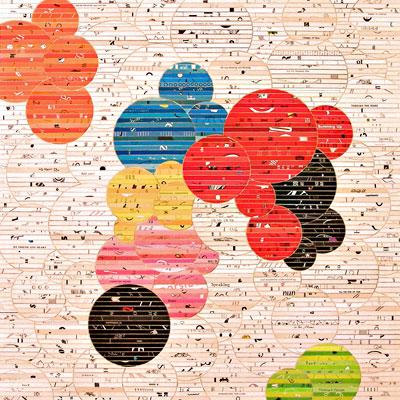
But that is just one work, and an exception to most of the others, which are from books, organized into primarily circular compositions made from strips cut from pages and covers. The artist groups the deeper colors into coordinated sets that can look like clouds at sunset, thought bubbles, boccie balls, or a collection of Venn diagrams. The words can seem deep or ridiculous, and it is hard to walk away from individual works because the tonality, color, and text don’t let go easily.
The more colorful orbs evoke Japanese anime. Those with more neutral compositions look organic, perhaps like cross-sections from plants or wood or frogs’ eggs. There are strictly rectangular compositions as well, which tend to be vertically oriented and can look like the glimpse of something concealed behind bars or stalks of grass. The artist might use color here as well to unite certain groupings of the cut strips into blocks or brick shapes.
All of these collages have buried snippets of images or text, and the scattershot lines and words can form cohesive patterns in the work. Nothing too literal, but the eye does link certain passages to each other, intentional or not. A work taken from thinner magazine stock is multicolored and a bit translucent. Mr. Fischer has cut these pages into ovals and grouped them in color fields that have a certain Mark Rothko quality in their own striations.
What unites all these works is the precise application of the paper pieces. In the strip works, whether rectangular or circular in their orientation, the surface that forms the linear space between them looks carved rather than created by the knife-sharp cuts of the paper and its surgically exact application. Even in “Yesterday’s Son,” the Rothko-esque piece, the orbs of paper have a completely uniform pattern, as if it were a computer printout.
The artist said he sees his use of this material as rescue for abandoned modes of communication and entertainment in our increasingly digital culture. The inclusion of album covers, however, offers a glimmer of hope. For several years now, as vinyl returns to the mainstream as a preferred way of experiencing music, it has seemed as if some forms of media may never die after all. He recycles not only his materials but the thoughts and memories that he associates with the texts and forms of music he chooses. There’s something here that is meaningful and moving. He provides not necessarily a final coda, but a paean and prescription. Even if the patient has flat-lined, he offers rebirth into something as beautiful and full of meaning as possible.
The show will be on view through Sept. 22.
