The Wide and Narrow World of Stephen Antonakos at Drawing Room

Stephen Antonakos, a neon pioneer from the 1960s onward, discovered several different styles within that medium from that period until his death in 2013. From outlines of simple geometric shapes to complicated overlays on painted surfaces, and late work with neon-backlit painted wood assemblages, he found in the colorful gas tubing a visual language to explore relationships between two-dimensional and three-dimensional forms.
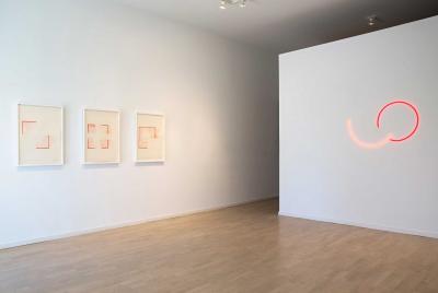
The Drawing Room has an exhibition of work from the artist’s mid-career early-neon phase, in years spanning 1973 to 1977. The work is simple and elegant, only six sculptures, each set on its own wall, only in colors of red and blue. The balance of the show is a series of preparatory and standalone works on paper and one gallery devoted to a visual conversation between the artist and two of his contemporaries, Vincent Longo and Jack Youngerman.
We learn much from these selections. One important lesson is that Antonakos understood the value of placement in his works. An earlier work, from 1974, is called “On the Floor Corner Neon Square,” and offers a clear directive to any ambitious curator to save a creative installation for another piece. The Drawing Room, as in a photo from his studio, places the work on a floating wall, at the corner of where the wall ends and the floor begins. This makes that white space become part of the sculpture in a way that could be lost if it was merely placed at the intersection of two walls.
Was that the artist’s intention? Naomi Antonakos, his wife, said the piece was “defined by its position on the floor, at the left edge of the wall.” But, she said, the wall does not have to be free-standing. The sculpture could be placed where two walls meet. The artist was concerned about the height and widths of the walls in the context of these pieces. “There is a point beyond which the proportions would feel wrong to anyone used to looking at architecturally sited art,” she said. This is something that can be determined by a sense of proportion to the piece’s three-foot-square dimensions, or what feels right, rather than a specific measure.
It is important to note that the artist defined the space of his art as containing both the work and the viewer. If that is the case, proportion does become key to the work’s success. Too much white wall space and the intimacy established is lost; too little, and the space becomes too crowded to connect with the piece. The gallery’s decision to place it on a naturally backlit wall uses its architecture to provide a hint of the artist’s later work with a kind of novelistic foreshadowing.
On an opposite wall in the front room is “Ruby and Red Incomplete Neon Circles,” taking up all of the real estate there. The one-sculpture-to-a-wall ethos that the installation works under is liberating and eye-opening, allowing each piece to have a chance to sink in and leave a mark. These fractional spheres, seen here and at other points in the gallery in shades of blue, have a balletic grace that seems as natural as breathing or a gurgling stream.
“Incomplete Blue Circle Inside Corner Neon” has the evanescence of the Cheshire Cat’s smile, the floaty feeling of an apostrophe, or the promised wish of a fallen eyelash. It is the simplest, yet perhaps the most satisfying of the neon works. Placed in the middle gallery among its racks and stacks of inventory, it is a happy surprise in an unexpected nook.
“Small Corner Incomplete Square” is all angular business, yet at the same time has a strong resemblance to the letter L, which makes it seem more lighthearted, especially in the color red. Neon’s long relationship to signage makes it difficult to banish such references, and it is curious that someone who brandished the medium to make larger statements about pure geometry and spatial relationships would risk such an allusion. Perhaps he was so completely taken with his own abstract aims for the work and its placement within architecture that he didn’t notice the association.
The exhibition is completed by a selection of drawings that may be as simple as preparations for his sculpture or vastly more complex, employing their own drawn architectural framework as the setting on paper. In them, he doesn’t veer too far from the same basic colors he used in neon. But they might have added layers or other elements missing from the studied minimalism of the sculptures.
In a further collection of drawings in a back gallery downstairs are more solid representations of the linear relationships Antonakas explored in previous years. Dating from the mid-1970s, these colored pencil-on-paper compositions hint at, quite literally, broader examinations of planes and surfaces in following decades. The show is on view through May 9.
